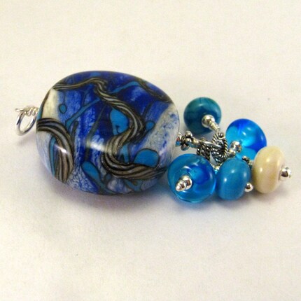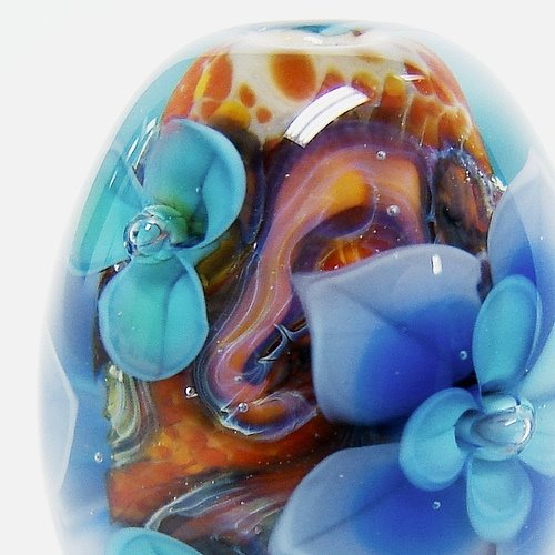
(Also Andrea is spoiling me rotten! ;) )

 I really like the look of the silvered ivory twisty cane meandering over the surface, with lots of richness and reactions.
 We're back, and now I can reveal where we were for the past week - taking a geological road trip through the Mojave and Grand Canyon region, and then winding up with two days in Vegas!
 We saw so many things, so I'll just stick to the glass-related stuff here. We explored two ghost towns, Two Guns (stone ruins, late 1800s to 1960s) and Chloride (wooden mining town, abandoned and then repopulated by an eccentric community). Andrea and I were fascinated by the shards of purple glass scattered everywhere in Two Guns. I collected a small handful, along with some cobalt blue and milk white glass. In Chloride I saw lots of purple bottle-necks but couldn't find anyone who could tell me what they were from. Now that I'm home I've googled it and have learned that the purple comes from a reaction between manganese in some pre-1915 glass and UV radiation from the sun. Which makes sense and is pretty cool. I'm slightly disappointed because it sounds like the purple colour will disappear if I melt it - which of course was my goal! I'm going to try it anyway and see what happens.
 In Vegas proper we saw lots of bizarre and amazing design, which will be a source of inspiration of a different kind than the natural wonders we experienced. We all went to Ka, which was worth every penny, even from the back row. There was a Dale Chihuly ceiling and gift shop at the Bellagio, so I finally got to see the controversial and influential designer's work up-close. Amazing colours. We also saw a Warhol, Lichtenstein and Friends pop-art/minimalist art exhibition (rather dark, actually - I got to apply my Cultural Studies courses and teach Andrea the term "anomie"). The visual theme of Vegas seems to be "vibration" - colours and patterns humming together. It became hard for me to process after a while, and will take me weeks to decompress...
 Carnelian Drops is lush and fun. I really love working with that colour of glass! Your eyes are not deceiving you; they ARE ever-so-slightly different shades of deep coral-rose. Carnelian is a very unpredictable flame-striking colour and it turns out slightly different every time, even though I made these two together on one mandrel. I think the harmonious tones add depth and personality to the earrings.
 River rocks is a similar chain-dangle style with a completely different mood. This one is earthy and serene. I love how silvered ivory looks under drops of clear. The tiny fritted ivory accent beads are threaded onto the delicate silver chain, so they can move freely while the main beads dangle below. The best part is that these earrings will go with almost any outfit!
 Finally, I just finished listing Bubblegum Gelato, which I describe as "sweet and geometric, like cupcakes made by a math prof grandma." Maybe I am overdoing it with the similes... Or maybe I am overdoing it just enough? You tell me. :)
 But since then we've expanded and improved our glass collection and tools every year. We bought a house, built a studio and grew our glass hobby into a flourishing part-time art micro-business. But I think I've held on to my hesitance to spoil myself with "fancy" glass colours.
  We're imagining dramatic possibilities for Charcoal, a deep transparent grey. Cirrus will add a misty, milky effect to encasing and sculptural work.
 I'm so excited! Stay tuned down the road for the results of my new colour experimentations.

 I've chosen Effetre Ultra-Clear, which is about 30% more expensive than regular Effetre clear. It has gotten a good reputation as clean rod, but it can boil if mistreated in the flame, just like regular Effetre clear. I've had good luck with Effetre clear in the past, though, working far back in a cool, slightly oxidizing flame. So I'm not worried about the formulation, just crossing my fingers that I get a nice, clean, unscratchy batch of cane! :) I'm unable to make my beloved florals until it arrives, so wish me luck... *twitch, twitch*
 Heather melting a glass gather on the torch. (It's from last year with our old workbench)
 Andrea putting a finished bead into our AIM 84-BD digitally-controlled firebrick kiln.
 Augh! Oh, no, wait... It's just our studio. It's okay. We know it's creepy-looking! Look past the spooky walls and you'll see our 350CFM exhaust fan, natural gas connection, tiled and sheet-metaled workbench, active glass rod organizer, and lots of tool storage. The corner bench was made by Andrea as part of a theatre set, and assembled by her using extra 2 x 4s and countertop offcuts from our home renovation projects.
  Here's a close-up of our beloved Bethlehem Piranha bench burner. The green line brings us oxygen from our two oxygen concentrators.
  Here's the good stuff! Part of our glass rod storage - our opaques and half our transparents. Each rod of glass has its own properties and behaviours in the flame. Some are regular price, others are super-expensive. We just reorganized our storage and it's so inspiring to see all those colours together. Isn't it lovely?
 These are some of our graphite shaping tools. We use the plain one most, of course, followed by the Osibin Shaper on the far left. The others are newer toys. I've had good success with the lentil shaper, second from the right.
